NY Workers Rising: Raise Up NY
NY Workers Rising: Raise Up NY
When we came on board to help launch #RaiseUpNY–a campaign to give communities the power to set local minimum wages–we felt it would be important to 1) knit together the various low–wage worker campaigns, expressing them as a movement, and 2) sideline the typical human interest story of suffering in favor of an empowering one that lifts up the voices of low–wage workers, depicts them heroically, foregrounding their individual agency and collective action.
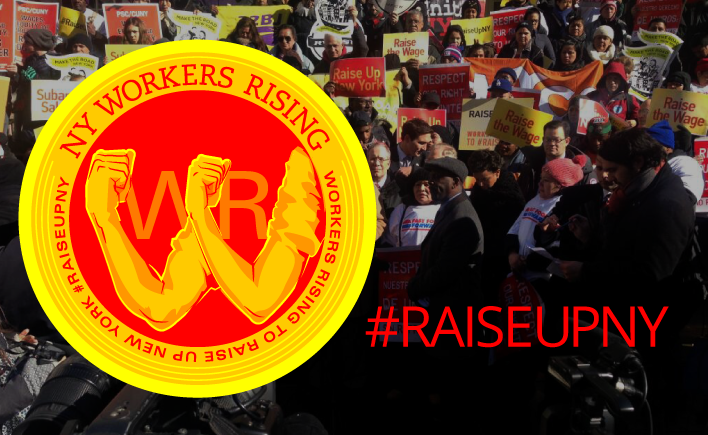
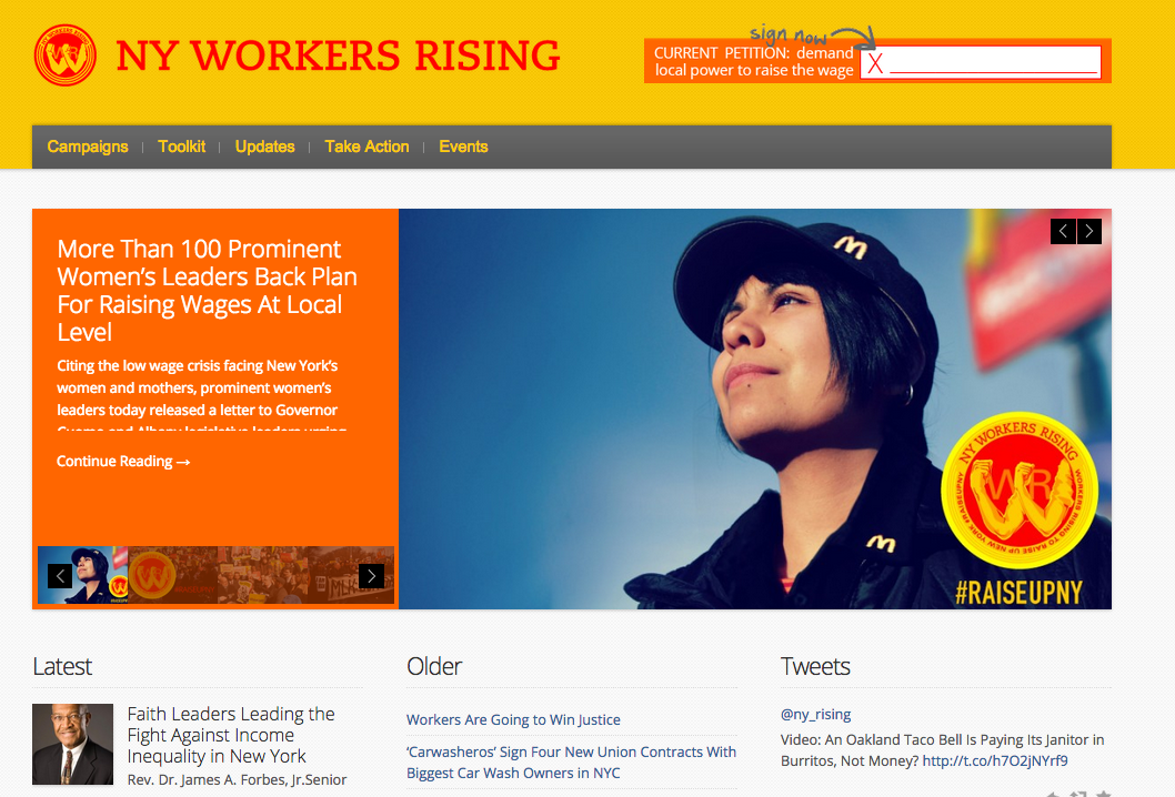
We started by designing and developing NYworkersrising.org, a place to aggregate updates from low–wage worker campaigns with a considered visual identity. The logo mark is a badge system that can accommodate different hashtags and campaigns. It references Rosie the Riveter and the profuse and iconic McDonalds logo, depicted upside-down. Fast food and other low wage workers have been a heroic base. When organized, their strength can turn a monolith like McDonalds on its head.
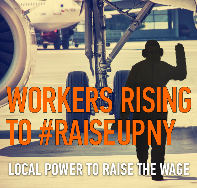
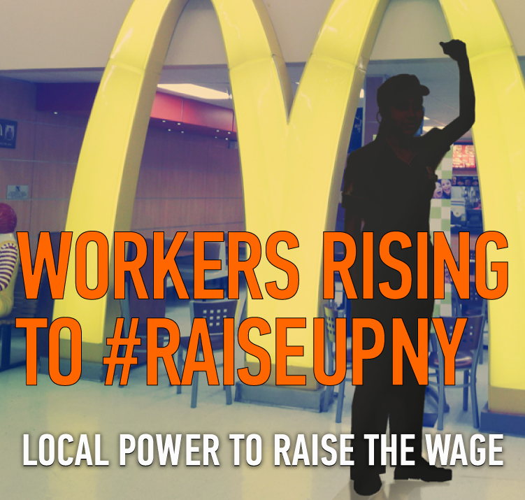
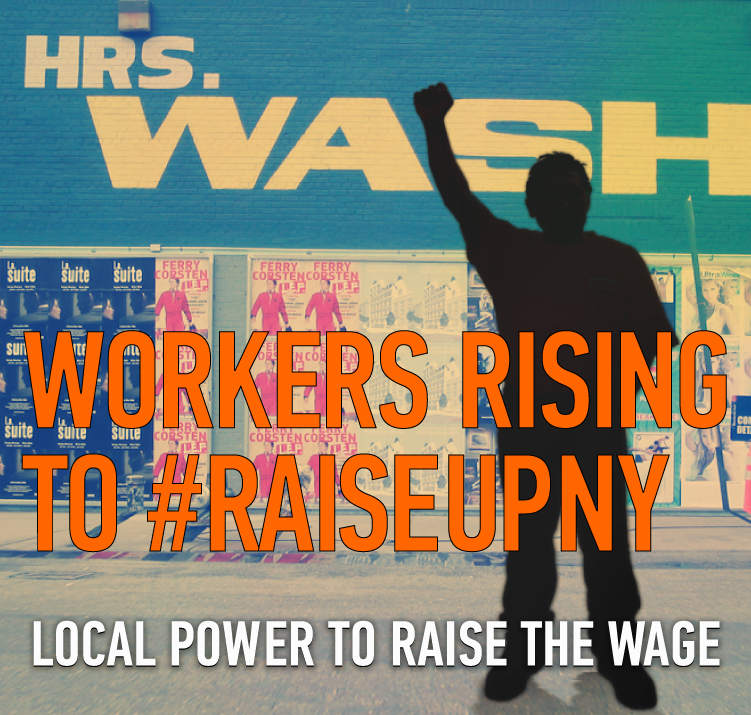
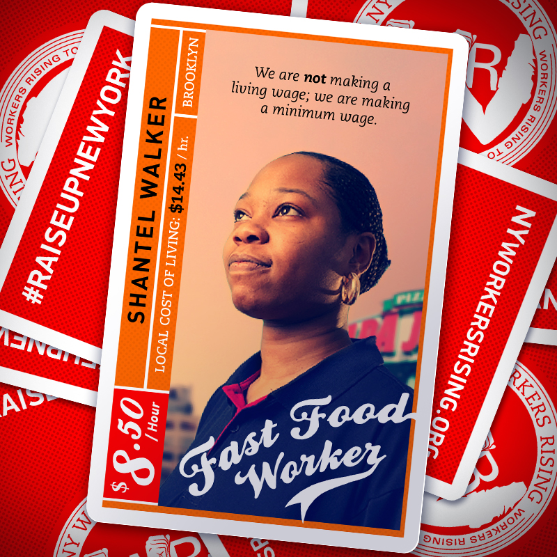
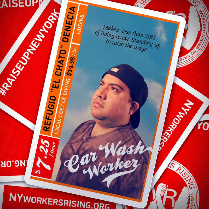
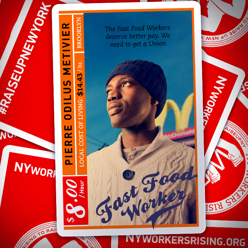
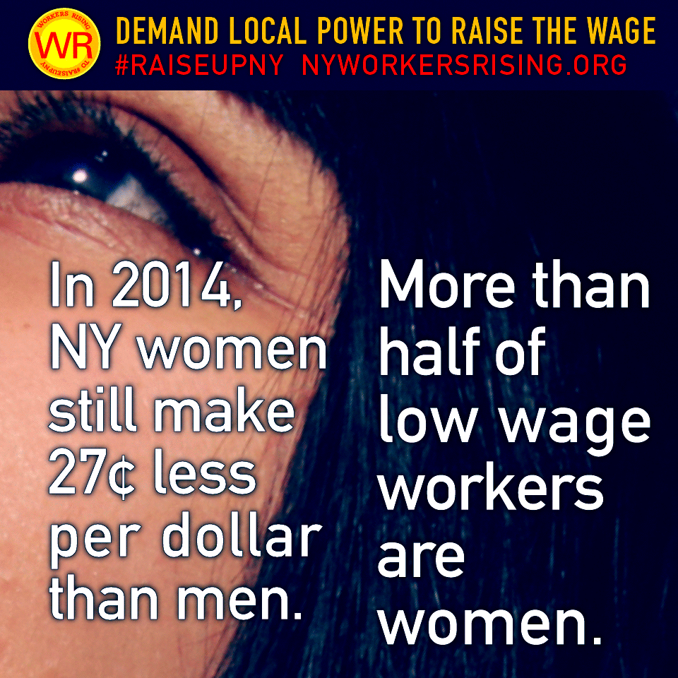
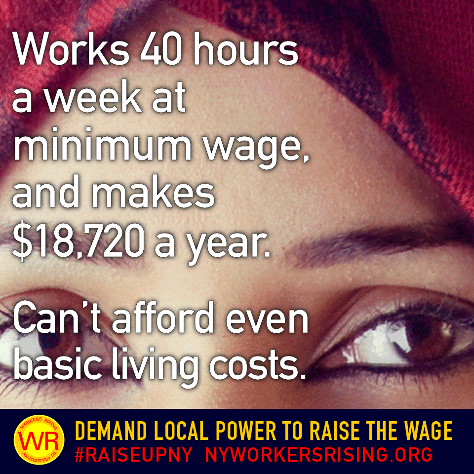
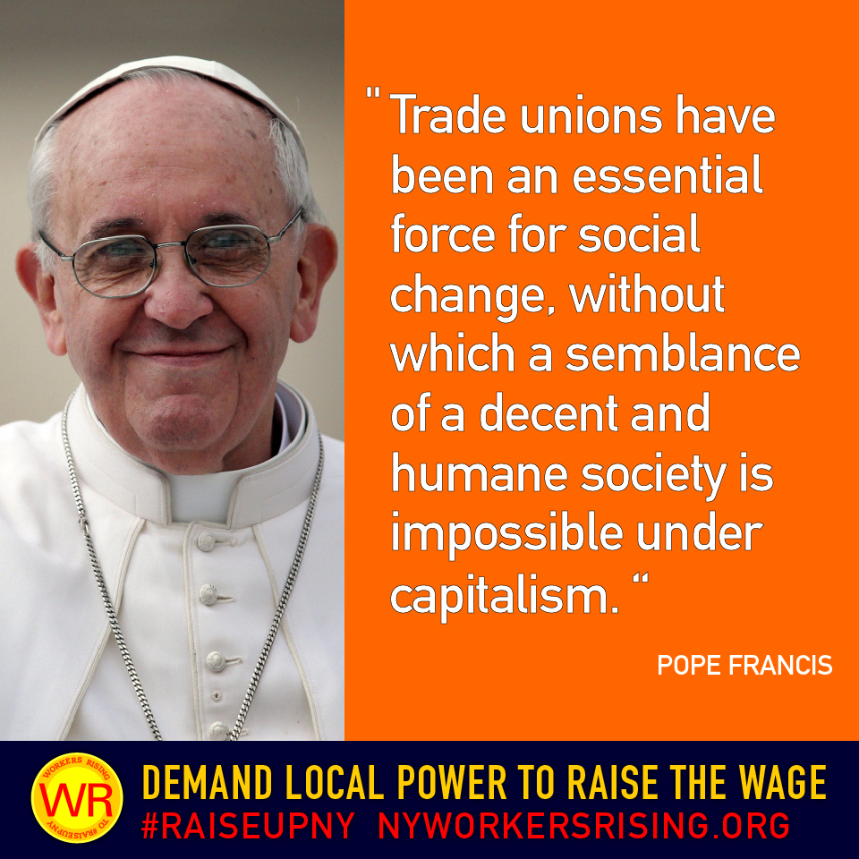
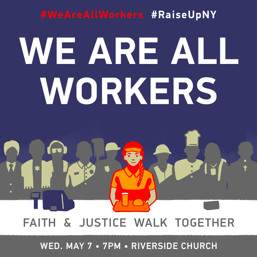
From there we introduced our worker-heroes. First as silhouettes, individuals made emblematic (and defiant!) against the backdrop of their workplaces. Our next social media graphics push featured our working class heroes on baseball trading cards. After that, we created social media postcard series that represented the campaign’s organizing of women’s groups, elected officials, and faith-based communities, and props and signage that could represent the campaign in rallies and demonstrations.
Clients
New York Communities for Change United NY Strong Economy for All Coalition
What We Did
Creative strategy; Website design, development, content population; Identity development and design; Social Media strategy; Copy-writing; Graphic design; Photography; Props and signage.
Date
April 22, 2014


